 What follows is a slight rewrite of an article I posted two months ago on captchas. I value comments from readers. It's part of what makes doing this worthwhile. Unfortunately, doing without captchas in comments means there will be spam comments to clean out, which is something I will not deal with, as I explained in that article. Unfortunately, Google has since found a way to make the comments captchas even more unreadable. I am reposting this article to remind readers of some ways of making the blasted things easier to deal with.
Because this subject came up on another blog, I thought I'd add a point about how I manage comments here.
The first thing I should say is that, thanks to the way I have things set up, I don't have to manage them all that much. I like it that way. I don't have to spend a lot of time, as I do for another blog I associate with in a different persona, cleaning out spam comments that people from around the world feel obliged to leave there.
I've written before about how I have comment moderation set up, and none of that has changed. What I have not done is noted that I also use captchas, which is that annoying graphic that looks vaguely like Roman alphabet letters that you have to type in so that you can comment here. Compared to that link in the last sentence, I think that the Blogspot captchas used to be easier to read. Sadly, they no longer are. They are deliberately made more difficult to read than standard print. That is supposed to make them more difficult to interpret using software, which in turn makes them more difficult to fool to put spam into blog comments and online forums.
Still, if someone has a bit of difficulty reading anyway, captchas can be an obstacle to posting. I suspect that people who are dyslexic, for instance, would have more trouble. People who have trouble reading the screen to begin with, of course, are also going to find it harder to interpret captchas.
I don't intend to change this policy. I'm sorry that it's harder to comment because of them, but the only alternative I see is either to put every comment into moderation, which can take time and (at least theoretically) limits commenters' ability to interact with each other, or to spend a lot more time watching comments. I don't want to do either.
So, what I will do is offer some advice on how to make them a little less irritating.
Most modern browsers, Firefox being the one I'm most familiar with, have had a way of enlarging whatever is on the web page the user is looking at for several years now. That feature, normally referred to as "zoom", enlarges both graphics and text. Using Firefox, a page can be zoomed larger by using the
Ctrl-+ key, which means holding down that key in the lower corner of the keyboard marked Ctrl, and then hitting the plus (+) key (of course, you'll have to hold down the Shift key at the same time, if you're using a standard U.S. keyboard). The Ctrl-- key (the minus key with Ctrl) will zoom the page smaller. If you can't remember how many times you enlarged or reduced the screen, then just hit Ctrl-0 to reset it to what it would be normally.It looks as though Google's Chrome works this way, as does Internet Explorer.
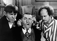
Go ahead and try it by scrolling to the top of this page and using those keys. Note that both the image of the Stooges and the type get larger or smaller. That's what will happen to captcha images as well.
To sum up:
- Zoom in (enlarge):
Ctrl-+ - Zoom out (reduce):
Ctrl-- - Reset to normal size:
Ctrl-0
Command key (that key to the lower left of the keyboard that looks like a splat) anywhere you see Ctrl, and things should work the same.Give it a try. It's possible that this won't be enough. In that case, please let me know, but it's something to try. It's also possible to comment via e-mail. I promise I'll read your comments, provided they aren't caught in the spam filter of my e-mail account.
Afterword: In a comment on that earlier post, James Ala explains how things work on Macs:
In OSX the Command key works almost like the control key in Windows. Thus command +/- to zoom in or out. Works in Firefox and in Chrome, plus in Opera. I won't test Safari because I can not stand that browser.So, to sum up, substitute the Command key anywhere you see
Ctrl in the article, and it should work on Macs, too, with the possible exception of Safari.Thanks, James.
No comments:
Post a Comment